


Key Takeaways
- A strong website layout helps visitors quickly understand information and take the right action.
- Start with a clear purpose before adding visual elements or design trends.
- Use content hierarchy, spacing, typography, and navigation to create an easy-to-follow experience.
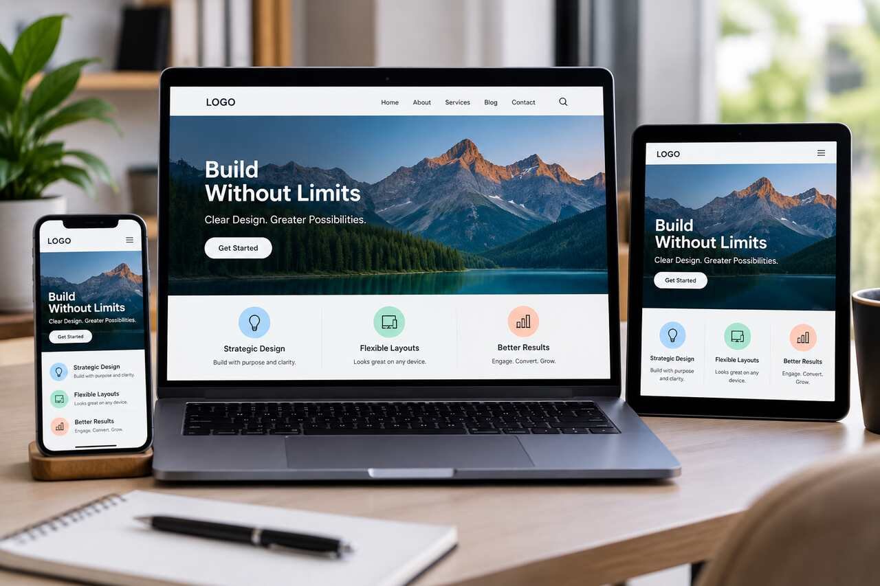
- Responsive design ensures websites remain useful across phones, tablets, and desktop screens.
- Visual effects should support usability rather than distract from important content.
- Accessibility, testing, and user feedback are essential parts of effective layout design.
- The best layouts balance creativity, clarity, performance, and user needs instead of simply copying popular trends.
A strong website layout helps visitors understand where they are, what matters, and what to do next. It is not simply a visual container for content. It is the system that shapes attention, supports decisions, and makes information easier to use. Reviewing grid UI design examples can be useful for inspiration, but the best layouts are built around the needs of real visitors rather than copied from a trend. In 2026, effective websites still balance personality with clarity, speed, accessibility, and flexibility. A page can be visually impressive and still fail if users cannot find pricing, understand the service, complete a form, or confidently move to the next step.
Why Layout Still Matters
Layout determines how easily people can scan a page, compare options, and take action. Consider two service websites. One states what it offers, explains its benefits, and provides a visible contact option. The other uses dramatic visuals but leaves visitors guessing about its services. The first layout earns attention because it reduces effort.
Start With Purpose, Not Decoration
Every layout choice should serve a page goal. Before selecting colors, illustrations, or animation, identify the audience, the problem they want solved, the most important information, and the action they should take. Also, decide which pages are central to the customer journey, such as service, product, booking, or contact pages.
A Quick Planning Exercise
Write one main goal for the page and two supporting goals. For example, a consulting homepage may aim to generate discovery calls, while supporting goals include building trust and explaining the process. If a design choice does not support one of those goals, it probably does not need to be there.
Build A Simple Content Hierarchy
A clear hierarchy gives content an understandable order. Start with the main idea, then explain its value, add proof through examples or visuals, answer likely questions, and finish with one logical next step. Use one H1, meaningful H2 and H3 headings, short paragraphs, and labels that tell visitors exactly what they will find. Related information should stay together. A testimonial belongs near the claim it supports, and pricing details should not be hidden far from the offer they explain. This structure makes pages easier to scan without forcing visitors to read every word.
Choose The Right Layout System
Select a layout system based on the content and the work visitors need to do. Responsive web design helps a page adjust to different screens, but the underlying structure should remain useful at every size.
- Single-column layouts work well for articles, focused landing pages, and step-by-step guides.
- Multi-column layouts support dashboards, comparisons, and information-rich interfaces.
- Card-based layouts help groups separate services, resources, or categories.
- Asymmetrical layouts can create energy when the reading path remains obvious.
- Modular layouts make it easier to reuse reliable sections across a growing website.
Design For Small Screens First
Mobile should shape the earliest layout decisions, not become a last-minute repair. Begin with the smallest screen, where space is limited, and attention is valuable. Keep the main message near the top, use readable text, leave comfortable space around controls, prevent horizontal scrolling, and make menus simple to open and close. Once the small-screen version works, expand it for tablets and desktops. This approach encourages teams to prioritize essential content before adding secondary elements that may compete for attention.
Use Space, Type, And Contrast Wisely
White space is not wasted space. It separates ideas, creates rhythm, and lets visitors see where one topic ends and another begins. Use consistent spacing between related elements, limit the number of typefaces, and keep line lengths comfortable enough for sustained reading. Contrast is equally important. Text must remain readable against its background, while bold type should highlight key points rather than turn entire paragraphs into visual noise. Repeated buttons, cards, and form fields should look and behave consistently.
Add Visual Interest Without Adding Noise
Strong typography, imagery, layered sections, and subtle motion can make a website feel memorable. Each effect should have a job. Motion can confirm that an action succeeded, guide attention to a new section, or show a relationship between elements. It should not delay reading, conceal navigation, or distract from a primary button. Choose images that explain the offer, show the product, or create useful context. Decorative effects should be kept away from critical controls, especially on smaller screens where every visual element competes for space.
Make The Layout Easier To Use
Accessibility improves a layout for people using keyboards, assistive technology, smaller screens, or different viewing conditions. The basics of web accessibility reinforce a practical principle: make structure and interaction understandable from the beginning.
- Use heading levels in a logical order.
- Add useful alternative text to meaningful images.
- Keep keyboard focus visible.
- Do not use color as the only signal of meaning.
- Provide clear labels, helpful errors, and readable form fields.
- Respect reduced-motion preferences.
Test The Layout Before Launch
Testing reveals problems that polished mockups can hide. Open the page on a phone, read only the headings, and check whether the main point is immediately clear. Then try to complete the primary task, such as requesting a quote or finding product details. Test buttons, menus, links, forms, keyboard navigation, and image loading. Finally, ask someone unfamiliar with the project to complete one task without guidance. Their hesitation can expose unclear labels, weak content order, or actions that are too easy to miss.
Common Layout Mistakes To Avoid
- Starting with effects before defining the page goal.
- Giving every section the same visual weight.
- Building for desktop first and allowing mobile to break later.
- Hiding important information behind unnecessary clicks.
- Using tiny type to fit too much content into one view.
- Adding animation that interrupts reading or navigation.
- Copying a popular pattern without considering the audience.
- Ignoring error states, empty states, and longer real-world content.
A Simple Pre-Launch Checklist
- Does the page have one clear purpose?
- Can visitors understand the main message quickly?
- Does it work on phones, tablets, and larger screens?
- Are headings, links, and buttons easy to scan?
- Is the text readable against the background?
- Can visitors complete the main task without confusion?
- Does the layout still work when the content becomes longer?
A shared design system can keep typography, spacing, colors, and components consistent as a site grows. Reusable rules reduce unnecessary variation and make future pages faster to build and easier to maintain.
Conclusion
A practical website layout makes information easier to find, read, and use. Start with purpose, create a clear hierarchy, design for small screens, and use visual details only when they support the visitor’s task. Trends can offer useful ideas, but a layout succeeds when it helps real people move through a website with confidence. A strong layout balances creativity with functionality by organizing content in a way that feels natural and predictable. Clear navigation, consistent spacing, readable typography, and thoughtful placement of important elements can improve the overall user experience. When every design choice has a purpose, a website becomes more than visually appealing, as it becomes a helpful tool that guides visitors, reduces confusion, and encourages meaningful interaction.
